Nothing ruins a good user experience more than suddenly being caught off guard. But this isn’t just a drawback for the user. People have short attention spans, especially when using devices. Including easily avoidable areas of friction on your site can be the thing that turns a user away before they engage.

Here’s a quick rundown of common design trends that are currently causing my temple to twitch.
Mystery meat buttons & hidden functionality
Icons are great, why waste valuable device screen space with words when we have simple ubiquitous icons to convey the same meaning? Unfortunately not every action has a meaningful icon to represent it to every user. We all know our hamburger icons and our play/pause buttons but what happens when we have something more abstract? We get mystery meat.
Having some friends over and listening to a Spotify playlist, what can go wrong? The queue from your last listening session can start playing…

Right, I need to clear the queue quickly and brush this off as some kind of weird bug before the questions start. But where is the queue? Spotify’s queue functionality seems to be hidden and there’s no obvious way to access it. I can only find ways to add more to the queue and that’s how I got into this mess!
Turns out pulling up the currently playing song and tapping the unfamiliar bottom-right icon pulled up the queue, but by the time I got there, we were already onto Tragedy. Fitting.
Navigating from the ‘currently playing’ view to ‘queue’ makes sense only if the user is currently looking at that view. If the user starts off from the playlist view then there is a disconnect between what is currently being played and what the user is looking at.
This encourages the user to tap around trying to find what they are looking for, and when the functionality is hidden behind an unfamiliar icon it makes for a frustrating experience. Does that icon look like a queue? As the user is tapping around it’s easily missed.
The user shouldn’t have to waste any time thinking about what an icon looks like. If it’s not immediately obvious then it’s not doing its job. Spotify has a weird habit of hiding its functionality, this should have been a simple case of Home Screen > Queue (as a labelled playlist) and no tapping around frantically trying to find where the credibility eroding music is coming from.
Pop-Ups
This is a difficult one. Popups have been around almost as long as the internet has and they’ve annoyed users since their inception. Despite this, they are proven to boost signup rates so it doesn’t look like they’ll be going away anytime soon.
However, with newsletter signups, push notifications and cookie/marketing consent popups firing off it can leave the user feeling like they are viewing your site through a letterbox. Type ‘popup’ into chrome and the majority of links are about trying to turn them off.
Too much appearing on screen at once is going to make users bounce, so we need to start thinking about how and when our popups are firing. Cookie consent forms are a legal requirement but do they have to take up the full screen? Does a user want to sign up to your newsletter the minute they hit the site? Has anyone in the history of mankind ever clicked ‘allow’ on a browser push notification to a site they’ve just landed on?
Preventing your cookie forms from obscuring content and using exit popups rather than immediately bombarding visitors with signup forms will achieve the same (if not better) conversion rates whilst feeling less aggressive to the user and leave them feeling like they might even want to visit again.
At the end of the day a user is visiting your site for its content and when you block that content immediately from view you are not adding any value or creating a good first impression, just frustrating the visitor.
Confirm Shaming
Annoying pop-ups are one thing, but being insulted or coerced into doing something you don’t want to do doesn’t belong on any site. A few years ago the ‘Confirm Shaming’ pop-up popped into existence and ruined everyone’s good time by imbuing the internet with a large dose of passive aggressiveness.
The idea is to lightly coerce the user into choosing the option you want as opposed to the action that they want. This is achieved by making the less desired option (the dismiss option) seem stupid or ridiculous.
They generally work by displaying a bright confirm button along the lines of;
“Yes I want to join your site’s newsletter even though I’ve only just landed on it, I can’t wait to get all the things!”
Next to a usually grey or plain text link;
“No I don’t want to give my personal information to you straight away, I must have no friends and staple hamsters together for fun”
This probes the user to make the desired action as the alternative sounds like the worse option.
Think I’m exaggerating?

I mean, that’s pretty brutal. This is downright trying to scare the user into allowing notifications or otherwise die. I don’t even think we can class this as bad UX, it’s more like an illustration of corporate sociopathy. (credit to https://twitter.com/i_anic/status/1039127723388612609).
Maybe their updated popup works better?

Whilst this is a fairly extreme example here’s one I saw on Audible the other day which left me wondering if it was a more refined/subtle version of the same practice.

This is nowhere near as bad as MyMedic and in contrast, seems harmless. But it’s still applying a narrative to your decision making and lightly pushing you towards making the choice it wants you to make.
Confirm shaming is considered a Dark Pattern and as the practice has become more well-known people are starting to document and ridicule the more extreme examples. Whilst it could increase signups it’s a short-sighted tactic and it isn’t going to endear your site to anyone.
Can I help you?
Do you know what’s great about shopping online? The ability to browse without being pestered by salespeople. Oh no, here come the chatbots.
There is a fine line between being available if a customer needs help and adding unnecessary distractions to the experience. Chatbots are starting to pop up on many eCommerce sites and are not all bad. However, having the live chat box appear immediately without prompting can come across as pushy and annoying. A user needs some time to browse and having a box ping in the corner may just prompt them to close the tab rather than face the awful task of talking to someone.
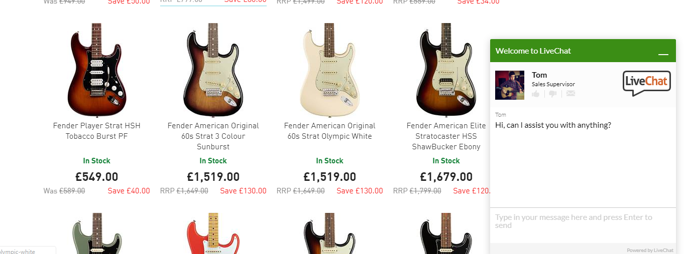
Having a chatbot or salesperson on hand at the corner of the screen is convenient for the consumer and good for the business who want to remove friction. Care must be taken, however, having the window immediately popup with what could be (or is at least pretending to be) a real person feels intrusive and may chase away users who aren’t expecting it.
Carousels and multi-page lists
Really?! We’re still doing this? Stop.
No one clicks through a carousel, no one has the patience to sit through a carousel, only the first slide of your carousel will ever be seen.
Most carousels move too quickly for the user to read. If a user wants to go back and read the previous slide the navigation buttons are often small and difficult to see in relation to the large background images. Once the user clicks back control is again taken by the carousel as it continues on its quest to get through every slide as quickly as possible. The user gets frustrated and leaves, leaving the rest of the carousel’s content unread.
The carousel interface also presents accessibility issues for those who are accessing the site via a screen reader or keyboard only users. An auto-scrolling carousel is going to be very tricky to navigate through at a reasonable pace using only a keyboard.
So if you want your content to be read and your CTAs to actually serve their intended purpose then don’t include them in your carousel. Or better yet remove your carousel entirely in favour of a focused hero banner and never think of it again.
To Finish
I hope you’ve enjoyed reading this quick run through of some of the current design trends that have made my pet peeves list of bad UX. As I said at the very start of this post, there are lots of examples of bad (and good) UX out there. If you’re interested in reading more around the topic, check these posts out by my colleagues Claire and Ant.


