We have been working with The Spectator for several years now. We first worked together in 2013, when we undertook the successful migration of their previous website to WordPress.
In addition to the main Spectator site, we have also developed a number of microsites, including a special site for the 2015 election and The Spectator Health, all of which would become useful foundations when we came to redesign the main site.
As you will be aware, the online world is a fast moving one, where stories come and go rapidly and articles can become viral in a matter of hours. As time passed and the popularity of the site soared, it was agreed it was time for a redesign. It was essential that the site continued to meet the thirsty demands of a modern, fast moving, high traffic, news based publication.
Goals
During 2015 we were approached by The Spectator to undertake the redesign of their main site in six weeks. As our usual research and discovery period alone takes that time, it was a slightly daunting task.
Although it was a tight time-frame, our previous work had given us a massive head start. We had got to know the team well over the years and knowing how they operate and what was expected of us and the brand helped us massively.
The basic goals of the redesign were:
- Reuse, re-purpose, and re-engineer existing setups and design work, and apply accordingly.
- Improve efficiency, both front-end and back-end.
- Modernise the look and feel without losing brand identity.
- Provide a better article reading experience.
- Enhance opportunities for subscriptions / advertising.
- Move to a fully responsive solution
Approach
Although we were reducing our usual research period, our existing knowledge meant a lot of the early project leg work had already been done.
To make the time-frame work, it was decided we would try to condense our usual design processes into a large, agile chunk. That meant no mock ups and we went straight to an open staging site based evolution. Basically we designed everything in the ‘open’. We had various rounds of feedback at staged points and evolved things step by step as we went along.
Looking back, this worked exceptionally well.
We started by using the basic framework built for The Spectator Health microsite. This provided us with the basics we needed to get something working very quickly. We knew it would be a robust starting point, as the microsite uses the right technologies and offered enough flexibility to evolve to the bigger stage of the main site.
This meant we then very quickly had something tangible for everybody to become invested in. The rest of the design and the build process was then flexible and fluid.
Design
Navigation
A lot of the content from The Spectator tends to be driven by social media. Users often drop onto content pages rather than arrive via the homepage. We felt it was important to try and keep users engaged with more specific and enticing related links and stories. We have a number of our own powerful systems for creating related links and top stories. Using these we hoped to keep people circulating through the site, by visiting these links rather than relying on the main navigation.
We also implemented a new masthead, with a much simpler, single level of navigation, which signposts the main hub pages of the site. This frees up space, giving a cleaner look and allowing signposting to be more immediate.
Typography
The first part of the visual design process was to put in place the main typographical elements of the site. The type underpins the way the whole site fits together, and sets the tone for everything else that follows.
The fact that The Spectator is a print magazine with over 100 years of heritage behind it, helped to make the font choices a lot easier. Our job here was to bring the fonts into the digital world and use them suitably. There were a few choices to be taken into consideration in this respect. Firstly, whether the fonts were readily available for use on websites and in a way that was usable. Secondly, using the fonts in a responsible way, so as not to impact on performance. The font choices were as follows:
- ‘Goudy Old Sans’ as the main headline font, which is supported by the italic version for sub-headings and standfirsts.
- ‘Futura’ used sparingly as the accent font, to highlight elements such as authors and section headings.
- The venerable ‘Times’ for the body text, set to use the system fonts of the site visitor, with a fallback to ‘Times New Roman’ when necessary. This decision saves a very significant amount of data from the initial page download and also gets around the other display issues that web fonts can sometimes cause.

All typefaces were chosen to evoke the feeling of the print magazine, but in a way that boosts readability in a digital format. The body text is set on the large side and line length is kept in the readable sweet spot of 45–75 characters (when viewport allows).
Layout
The general layout of the site’s template was informed by the framework of the Health site it was built on. Having said that, the Health site is a far more simple affair, so there was a lot of enhancement that had to take place before we were fully happy with the look of the site.
The main thrust of the redesign was to take that existing work and give it the correct Spectator look and feel. Again this feel comes from our past experience with the team, and is directly fed from the physical print publication.
Along with the large amount of weekly magazine content, there is a constant stream of content being produced via the ‘Coffee House’ part of the site. This is where writers are constantly reacting to news as it happens. The redesign allows the editorial team a lot of control over the content and layout and they can present content in several ways that weren’t open to them in the past.
Calls to action

The Spectator offers several subscription options and new calls to action were added in various places. One example is the teaser box in the masthead, to remind readers of the print magazine.
There are also areas, that allow for the injection of calls to action mid stream of content. This was designed with the aim of combating ‘banner blindness’ and hopefully straddling that thin line between visibility and annoyance.
Summary
Although this post focusses on the design element of the project, as with all big projects, there are many different strands to a build and there was a huge amount of work in the back-end.
My colleague Damian (responsible for the back-end build) ensured there was a massive focus on efficiency, streamlining to the admin systems and increased speed and performance. All of which was developed without upsetting the many other complex systems that weave through the site. But these discussions are for a future post.
Overall we successfully managed to redesign The Spectator site and take their web presence to the next level in an incredibly tight timescale. It was an enjoyable challenge, that made us really think about the main elements needed for a large build like this.
As with all websites, The Spectator site will continue to evolve over time, ensuring the needs of the readers are constantly met and work is already under way planning the next phases in the site’s development.
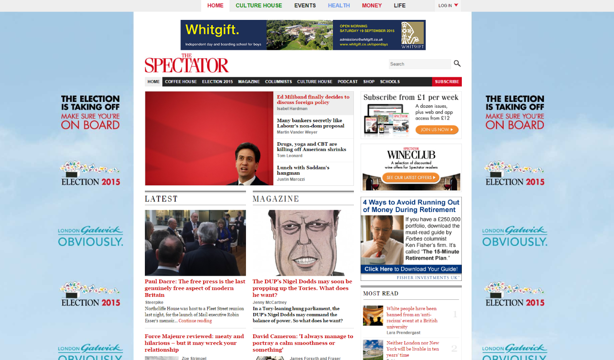
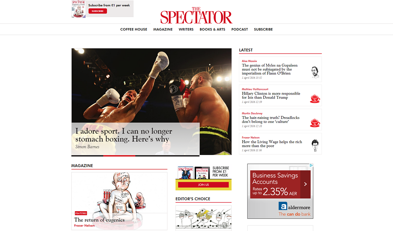
For contrast, the site pre redesign is shown below on the left and post redesign on the right. Click the images to enlarge.