Introduction
I started my working life as a print designer, sometimes working within a pre-press environment. QuarkXPress was the industry standard software at the time, with a large majority of the market using it – that all changed when InDesign came along. But that’s another story, probably a very painful one for Quark!
What does this have to do with web design? Well, I thought it might be useful to look at some of the differences between the two worlds, as a lot of graphic designers or print designers make the transition to web design, and a lot of people still think ‘flat mockups’ are the right approach.
At interconnect/it we can take a set of flat designs and create a fully functional WordPress site, but there are a lot of gaps that we need to bridge to make the design work interactively. Our preferred approach usually starts with some sort of discovery workshop, a lot of the time working collaboratively on-site with the client. We take the findings and create an initial design language and site structure – once that’s agreed we can get working within the browser, refining and testing based on client feedback.
Let’s have a look at some of the differences between print and web design.

Interaction
When a design is created for print, say a magazine, for example, the way we interact with it is totally different to a website. The experience is about moving through the information, turning pages in a linear way – turning each page and letting your eyes move around the information. You might arrive at an article you hadn’t planned on reading, which has pros and cons of course. If you want to digest specific information quickly, not so good, but on the other hand, you might discover something you didn’t expect, but which turns out to be useful or enjoyable. Serendipity versus personalisation, you might say.
Websites often function in a different way, it’s all about clicking and scrolling. And in many modern websites, being served relevant content in an ever increasing personalised format seems to be the norm. Ever clicked on an article and at the bottom it says ‘why not try these’? or ‘Read more about’? This is keeping you engaged within a narrow topic that might be relevant but doesn’t leave much room for exploring. Although there are other places to click, these links tend to be at the bottom of articles, guiding you to the next.
Print or screen
Fixed
One of the first things to talk about is obvious. Print design, as you’ve guessed, is all about creating something that will look good in some form of printed media. A fixed size that will not deviate. It’s also a closed media in the sense that if you happen to make a mistake and it gets sent to print, you might find yourself, or more specifically a customer, taking delivery of 10,000 brochures or magazines with a major typo! No second chances – check twice, print once! Being able to tweak content after it’s been published is an advantage a website has over a printed magazine in this way.

Fluid
Web design, on the other hand, is about creating something that works on multiple screen sizes. Having this factored into the design process is a fundamental difference – especially so in the last few years with Responsive Web Design (RWD) or Adaptive Web Design (AWD) becoming the standard approach. RWD was probably first spoken about in an article by Ethan Marcotte entitled, “Responsive Web Design” for A List Apart way back in 2010, today this practice is common place. Websites are very often a living, breathing medium, delivering a constant stream of information to multiple devices.
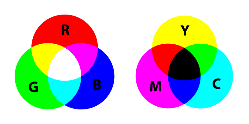
Colours
One of the basic building blocks of any design is colour, and the colour models used in print design and web design are totally different.
It’s about ink and light!
CMYK
Traditionally, print based designs have used a colour model called CMYK, this refers to the four inks used in most colour printing: Cyan, Magenta, Yellow and Black. This can vary in output depending on numerous factors, like the type of printing press, operator or even paper, not to mention special finishes you can apply, to add another layer of variation!
RGB
The RGB colour model is used for computer and mobile phone displays: Red, Green and Blue. The different lights are added together to display various colours. Similar to print, there are variables – you are reliant on the accuracy of the colour calibration of whatever screen you’re viewing a particular website on.
If we need some examples to explain, how about we look at the interconnect/it logo, or more specifically, how the red is represented? The printed version of the logo is created by using: C0/M95/Y100/K0. The percentages are the amount of ink mixed together to produce the exact colour red we want. In this case, the primary red was originally Pantone 485C, which is another colour matching system used in print design and often used as a starting point to create the base colour.
The version of the logo used on our website is created by using: R222 B19 G1. Colour values using RGB are usually within a range of 0-255, as you can see the values represent the colour. Hex codes, or to give them their full name, Hexadecimal codes, are another way to represent the colours – this method is usually used when designing and building websites with HTML and CSS. In our case, this would be #DE1301 for the interconnect/it red.
Typography
Print designers have the advantage of being able to choose from a considerable amount of fonts compared to web designers, although, this gap has become closer in recent times, especially with the amount of web font embedding services you can use. Google has a lot of open-sourced fonts you can use free of charge, which is great, but for a wider variety, there are other paid for services, like Typekit for example.
Another of the inconsistencies with using web fonts is how they can compare across multiple devices, platforms and browsers. Generally, there isn’t too much to worry about, but when using light versions of fonts there can be some variation, Windows fonts rendering is different to OSX for example.
Conclusion
There is definitely a different set of technical skills and knowledge needed, being a master technician with InDesign is no real advantage when you need to know about HTML or CSS.
Well thought out, considered design is at the heart of any type of print or web project. The exact processes and technical knowledge might be different, but ultimately it’s about delivering elegant solutions that solve specific design problems.


