The conferences bring together experts in the field of all things work and the WORKTECH Academy site exists to capture this inspiration and knowledge and share it across the global community.
Visit the site at www.worktechacademy.com to take a look for yourself.
Requirements
- Establish the WORKTECH Academy website as a trusted knowledge base, providing access to industry leading content, to be both publicly and privately available through various membership tiers.
- Creation of a strong online brand presence and design language, presenting WORKTECH Academy as a professional, forward thinking organisation.
- Generate new conference attendees through the site, with the creation of widget areas to allow the client to manage adverts for events.
- Workflow and administration to be as simple as possible, to reduce time spent updating the site. To be achieved by utilising our suite of in-house developed tools and plugins, making it easy to administer non-standard WordPress functionality.
Services
- Branding
- Website design
- Web development
- WordPress Theme and plugin development
- WordPress training
- Hosting
- Ongoing support
Project Background
We were approached by the Director of WORKTECH Academy, Jeremy Myerson, earlier this year, about designing and developing WORKTECH Academy’s very first website. For those who aren’t aware, Jeremy comes from a prestigious background as the co-founder of Design Week; holds the Helen Hamlyn Chair of Design at the Royal College of Art; and is a Visiting Fellow at the University of Oxford.
The project started with a full day discovery workshop at our office in Liverpool Science Park. As we have written about previously, we consider ‘discovery’ to be an integral part of our design and development process and this project was no different. To help form the basis of discussion on the day, we had asked Jeremy to think about the key requirements from his perspective.
Look and Feel
Equipped with a clear direction of the WORKTECH team’s requirements, Anthony Casey, our senior designer, set to work designing the site. Annotated flat designs were created and sent to Jeremy and other stakeholders at WORKTECH, which were analysed and sent back with feedback.
We’ve highlighted some of the main design decisions below:
Branding
As WORKTECH Academy was a completely new venture, there was no specific branding in place. This meant that from a design perspective we were starting from scratch.
After the discovery workshop, we knew we needed to produce something that was visually striking, that would communicate the Academy’s authority with experts in the workplace design industry. We also couldn’t stray too far from the existing branding of the parent WORKTECH branding.
We set about evolving that branding to incorporate the extra wording of ‘Academy’. We used the same wordmark and expanded it with the introduction of a block system that allowed us to combine the various new elements of the brand.
Site design
The block motif is echoed in a variety of ways throughout the site to communicate the core strands of the Academy’s expertise. The blocks change and combine in different situations to keep a consistent feel to the design language while providing visual interest.
The main WORKTECH font is used throughout the site for consistency and was paired with a complimentary sans-serif to keep a modern and fresh feel, appropriate for a site commenting on design.
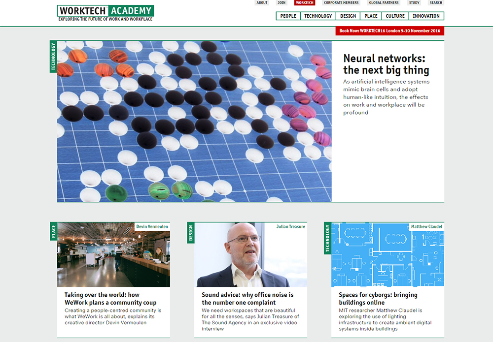
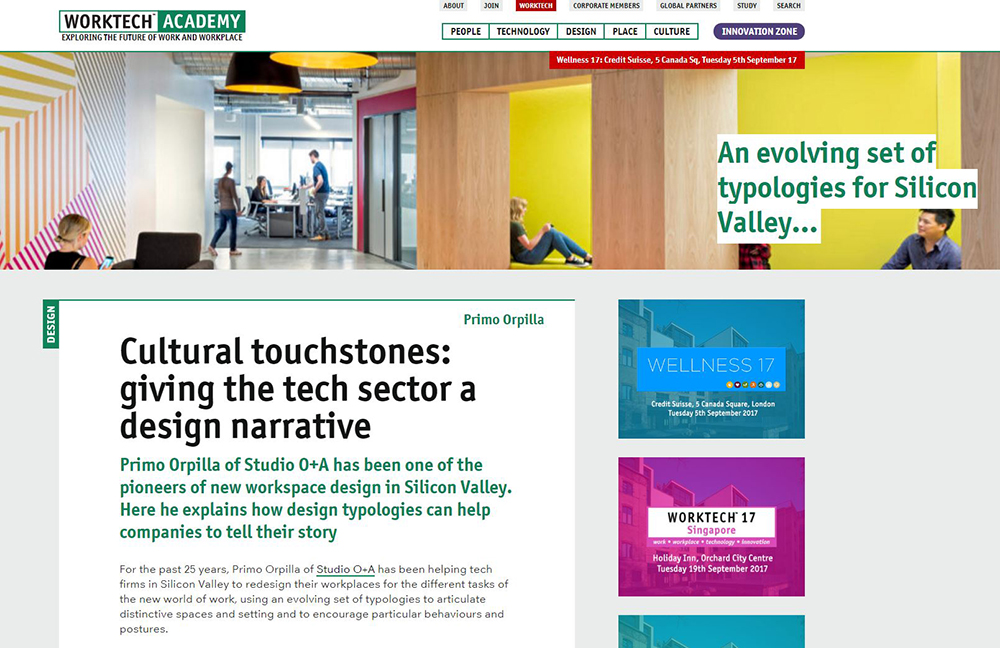
Striking, large imagery is used throughout the site to showcase the design credentials of the subjects being talked about.

Signposting
Articles within the site fall within six categories, these are People; Technology; Design; Place; Culture; and Innovation.
Early on we made the design decision to attach a clear label to articles on the homepage, linking them to other articles within the same category. This allows the user to dig deeper within the site and easily find other articles within the same category that may be of interest.
Similarly, clicking an author’s name, takes the user through to other articles by that author they may wish to explore.

The six categories are also shown within the main navigation at the top of the site. This allows a user who knows they want to search within a particular category to navigate straight there, without having to go through the list of articles on the homepage.
Password Protected Content
The WORKTECH Academy has three tiers of membership, Individual; Corporate; and Global Partnership. The first two tiers allow members to access password protected content and download reports as PDFs.
When a member signs up they are approved and sent login details and a password, allowing them to access the appropriate documentation. In term’s of administering the site and user experience, it’s a simple process and works well.

Challenges Faced
We enjoy a challenge here at interconnect/it and every project comes with it’s own unique ones! As this was to be the first site for WORKTECH Academy, initially there wasn’t any content for us to work with. During the design phase we considered how best to ensure the site worked fluently and easily for users. You can only define the design language so far by using Lorem Ipsum! We developed the design in phases, so once we had created the initial language, we created a number of key posts, pages and relevant dummy images. As the content became available, further refinements were made until the the final result was created which Worktech Academy loved.

Post Launch
The site was soft launched back in September to coincide with the WORKTECH16 Singapore Conference. Looking back, this was a great project to work on. We are well known within the industry for our innovative web development techniques, but despite designing several high profile sites, we are less well known for our design work. The nice thing about this project was that we had a decisive influence over most areas of the branding from the logo and imagery to fonts and colour scheme. We love the overall look and feel of the site and look forward to working with Jeremy and WORKTECH again in the future. Take a look at the site and see our hard work for yourself.


